
Table of Contents
- Running SmolVLM Locally in Your Browser with Transformers.js
- Introduction
- SmolVLM: A Small But Capable Vision-Language Model
- Transformers.js: Hugging Face Runtime for the Web
- Why This Pair Is Powerful (and Practical Caveats)
- Configuring Your Development Environment
-
Project Structure
- src/app/page.tsx: Main App UI and Orchestration
- src/app/worker.ts: Web Worker That Runs the Model
- src/utilities/Chat.tsx: Render Chat Messages and Status
- src/utilities/ImagePreview.tsx: Small Image Thumbnail with Remove Button
- src/utilities/Progress.tsx: Loading/Progress Bar
- src/utilities/types.ts: TypeScript Types
- src/utilities/utils.tsx: Small Helper
- src/icons/ArrowRightIcon.tsx: Arrow Right Icon
- src/icons/CrossIcon.tsx: Cross Icon
- src/icons/ImageIcon.tsx: Image Icon
- src/icons/StopIcon.tsx: Stop Icon
- Output
- Summary
Running SmolVLM Locally in Your Browser with Transformers.js
In our previous two tutorials:
- SmolVLM to SmolVLM2: Compact Models for Multi-Image VQA
- Generating Video Highlights Using the SmolVLM2 Model

We discussed SmolVLM (versions 1 and 2) in depth. We explored its architecture, training process, benchmarks, and more. We also demonstrated multi-image understanding tasks using the SmolVLM2 model and built a Gradio interface to generate highlight reels from long-duration videos.
Now, we are taking the next step: running the SmolVLM model directly in the browser using Transformers.js, Next.js, and Tailwind CSS. This tutorial will guide you step by step, with a detailed breakdown of every line of code and the reasoning behind it.
By the end, you will have a browser-based multimodal chatbot that understands images and text simultaneously, all running locally without a backend.
To learn how to run the SmolVLM model on your browser, just keep reading.
Would you like immediate access to 3,457 images curated and labeled with hand gestures to train, explore, and experiment with … for free? Head over to Roboflow and get a free account to grab these hand gesture images.
Need Help Configuring Your Development Environment?
All that said, are you:
- Short on time?
- Learning on your employer’s administratively locked system?
- Wanting to skip the hassle of fighting with the command line, package managers, and virtual environments?
- Ready to run the code immediately on your Windows, macOS, or Linux system?
Then join PyImageSearch University today!
Gain access to Jupyter Notebooks for this tutorial and other PyImageSearch guides pre-configured to run on Google Colab’s ecosystem right in your web browser! No installation required.
And best of all, these Jupyter Notebooks will run on Windows, macOS, and Linux!
Introduction
We will build a browser-based chat interface powered by the SmolVLM, a small yet efficient vision-language model released by HuggingFace. Once it is running, users can:
- Upload one or more images
- Type questions about those images
- Get real-time answers from the SmolVLM model
The secret sauce is Transformers.js combined with WebGPU: Transformers.js lets us load and run Hugging Face models in JavaScript, and WebGPU gives us the GPU acceleration we need for fast inference. That combination brings three immediate advantages:
- Zero Server Cost: the model runs client-side, so you don’t need a backend
- Privacy by Design: images and text stay on the user’s device
- Real-Time Interactivity: outputs can stream directly into the chat UI for a smooth experience
For the UI and app structure, we use Next.js and Tailwind CSS for rapid, responsive styling. Architecturally, the app centers on a main page (the UI), a Web Worker that runs the model off the main thread, and a handful of small utility components for chat bubbles, image previews, progress indicators, and more.
Before we dive into the code, let’s understand the two main building blocks in brief — SmolVLM and Transformers.js — so you know why this approach works and where its limits are.
SmolVLM: A Small But Capable Vision-Language Model
SmolVLM is designed to be lightweight and practical. Unlike huge multimodal models that require server-class GPUs, SmolVLM trades parameter count for efficiency, enabling it to run in memory-constrained environments (e.g., the browser). Key design goals are:
- Fewer Parameters: so the model fits devices with limited RAM,
- Optimized Architecture: that balances accuracy and speed, and
- Real-World Utility: for tasks such as image captioning, Visual Question Answering (VQA), and document understanding.
In practice, SmolVLM accepts images + text as inputs and returns textual outputs that reflect its visual understanding. Because the model is intentionally compact, it becomes a great candidate for on-device inference where privacy and responsiveness matter.
Transformers.js: Hugging Face Runtime for the Web
Transformers.js is the JavaScript counterpart of the Hugging Face Transformers Python library. It brings model loading and inference to browsers, and supports multiple execution backends:
- WebGPU: leverages modern GPUs directly from the browser for accelerated inference
- WebGL: GPU acceleration fallback for devices that don’t support WebGPU
- WASM (WebAssembly): CPU execution, slower, but works almost everywhere
Important features that make Transformers.js ideal for this project:
- Hub integration: load models directly from the Hugging Face Hub, similar to the Python transformers API
- Multimodal Support: processors and models that accept both images and text
- Streaming Generation: token-by-token callbacks let the UI show partial outputs as they arrive, yielding a real-time chat experience
Why This Pair Is Powerful (and Practical Caveats)
Put SmolVLM and Transformers.js together and you get a practical, private, serverless way to run multimodal AI in the browser. The main benefits are obvious: low cost, strong privacy, and great UX. The trade-offs are also important to acknowledge:
- Model Size Limits: very large models still won’t fit comfortably in most browsers; SmolVLM is small enough to make this possible.
- Device Variability: performance depends heavily on the user’s device and whether it supports WebGPU.
- Inference-Only: we’re doing inference in the browser; training or heavy fine-tuning still requires dedicated servers.
Configuring Your Development Environment
Before we start building, let’s set up the development environment. You’ll need Node.js (and a few related tools) to run our project.
What Are These Tools?
- Node.js: A JavaScript runtime that allows us to run JavaScript outside the browser. Required for Next.js development.
- npm (Node Package Manager): Comes bundled with Node.js. It manages dependencies (installing, updating, and removing libraries).
- nvm (Node Version Manager): Helps manage multiple versions of Node.js on the same machine. Useful if your projects need different versions.
- npx: A package runner that comes with npm. It lets you run commands directly from npm without globally installing the package (e.g.,
npx create-next-app).
Installing Node.js with nvm (MacOS/Linux/AIX)
To install Node.js in your system, open your terminal and run:
# Download and install nvm:
curl -o- https://raw.githubusercontent.com/nvm-sh/nvm/v0.40.3/install.sh | bash

# in lieu of restarting the shell
\. "$HOME/.nvm/nvm.sh"

# Download and install Node.js:
nvm install 22

# Verify the Node.js version:
node -v # Should print "v22.19.0".

# Verify npm version:
npm -v # Should print "10.9.3".
Here’s what we did:
- Installed
nvm, which manages Node.js versions (Line 2) - Loaded
nvminto the current shell session (Line 5) - Installed Node.js v22, which automatically comes with
npm(Line 8) - Verified that both Node.js and
npmare working (Lines 11 and 14)
Installing Node.js on Windows
For Windows, download the installer directly from the Node.js official website. This will install both Node.js and npm. If you need version management like nvm, you can use nvm-windows.
Creating a Next.js App
Now that Node.js is installed, let’s create a new Next.js project:
npx create-next-app@latest
Here:
npx: downloads and runs the package directly without installing it globally.create-next-app: bootstraps a full Next.js project with all necessary configuration.
When we run this, the CLI will prompt us with a few configuration questions. Below is the exact setup we’ll use:
- What is your project named?
→smolvlm-browser - Would you like to use TypeScript?
→ Yes (TypeScript provides type safety and a better development experience). - Which linter would you like to use?
→ ESLint (default and widely supported). - Would you like to use Tailwind CSS?
→ Yes (we’ll use Tailwind for quick, utility-first styling). - Would you like your code inside a
src/directory?
→ Yes (keeps the project structure clean and scalable). - Would you like to use App Router? (recommended)
→ Yes (Next.js 13+ App Router is the modern way to build apps). - Would you like to use Turbopack? (recommended)
→ Yes (Next.js’s fast bundler, ideal for development). - Would you like to customize the import alias (
@/*by default)?
→ No (we’ll stick to the default@/*which already works well).
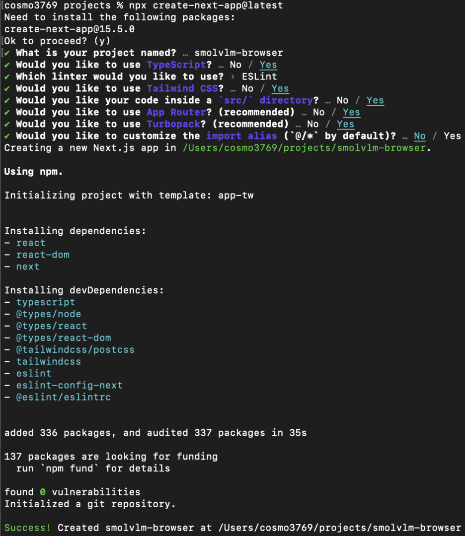
Once we confirm these options, Next.js will automatically generate the project with the required setup. After installation, we can move into the project folder:
cd smolvlm-browser
npm run dev
Our Next.js development server should now be running at http://localhost:3000.
Installed Libraries
Before moving on to the Project Structure, let’s install a few required libraries. We install it using the command npm i <library_name>.
@huggingface/transformers- This is the core library for running Hugging Face models in JavaScript/TypeScript. It provides access to
AutoProcessor,AutoModelForVision2Seq, and streaming text generation. - In our project, it powers the SmolVLM model, handles image and text inputs, and manages model inference in the browser via WebGPU.
- This is the core library for running Hugging Face models in JavaScript/TypeScript. It provides access to
better-react-mathjax- This library allows rendering mathematical formulas in React using MathJax. Useful if we want to display LaTeX or complex math in the chat interface or any component. It ensures formulas are safe, responsive, and high-quality in the UI.
dompurify- A library to sanitize HTML and prevent XSS attacks. When displaying user-generated content or parsed Markdown (like from
marked),dompurifyensures that no malicious HTML or scripts are executed in the browser.
- A library to sanitize HTML and prevent XSS attacks. When displaying user-generated content or parsed Markdown (like from
framer-motion- A React animation library for smooth UI transitions. It can be used to animate chat messages, hover effects, and buttons, making the interface feel more interactive and responsive.
marked- A fast Markdown parser. Converts Markdown text to HTML, enabling your app to render formatted messages or user-entered content. Works hand in hand with
dompurifyto ensure safety when rendering HTML from Markdown.
- A fast Markdown parser. Converts Markdown text to HTML, enabling your app to render formatted messages or user-entered content. Works hand in hand with
With the Next.js boilerplate ready and libraries installed, we’re all set to start integrating Transformers.js and the SmolVLM model.
Project Structure
After creating the Next.js boilerplate and installing the required libraries, here’s how we’ll organize our files for building the browser-based multimodal chatbot with Transformers.js and SmolVLM:
public/
 logo.png               # App logo

src/
 app/
   page.tsx             # Main application UI
   worker.ts            # Web Worker that loads and runs the model

 icons/
   ArrowRightIcon.tsx   # Send message button
   CrossIcon.tsx        # Remove/close button
   ImageIcon.tsx        # Upload image button
   StopIcon.tsx         # Stop/interrupt button

 utilities/
   Chat.tsx             # Chat interface (messages, user & model bubbles)
   ImagePreview.tsx     # Image preview with delete option
   Progress.tsx         # Progress bar for model loading state
   types.ts             # TypeScript type definitions
   utils.tsx            # Helper functions (small utilities)
Let’s learn about each file’s functionality.
src/app/page.tsx: Main App UI and Orchestration
This file is the single-page React client that builds the UI, manages user input (text + images), communicates with the web worker that runs the model, shows progress, and renders the chat.
"use client";

import { useEffect, useState, useRef } from "react";
import Chat from "@/utilities/Chat";
import ArrowRightIcon from "@/icons/ArrowRightIcon";
import StopIcon from "@/icons/StopIcon";
import Progress from "@/utilities/Progress";
import ImageIcon from "@/icons/ImageIcon";
import ImagePreview from "@/utilities/ImagePreview";
import type { Message, MessageContent } from "@/utilities/types";

const STICKY_SCROLL_THRESHOLD = 120;
We start with "use client" to mark this file as a Next.js client component. That ensures this code runs in the browser (not on the server). This is required because we rely on browser-only APIs (navigator, Worker, DOM refs).
Next, we define standard React hooks — useEffect, useState, and useRef
useRefis later used for theWorkerinstance and DOM references (textarea, chat container).useStateholds the reactive variables (status, messages, images).useEffectsets up side effects (worker lifecycle, window resize, etc.).
We also import UI components and icons (Chat, Progress, ImagePreview, icons). Importing types (Message, MessageContent) gives type safety in TypeScript.
STICKY_SCROLL_THRESHOLD is a numeric constant used when auto-scrolling the chat to the bottom — it determines whether to “stick” to the bottom (so the user reading older messages isn’t suddenly forced down).
export default function App() {
 const worker = useRef<Worker | null>(null);
 const textareaRef = useRef<HTMLTextAreaElement | null>(null);
 const chatContainerRef = useRef<HTMLDivElement>(null);
 const imageUploadRef = useRef<HTMLInputElement | null>(null);

 const [gpuSupported, setGpuSupported] = useState<boolean | null>(null);
 const [status, setStatus] = useState<null | "loading" | "ready">(null);
 const [error, setError] = useState<null | string>(null);
 const [loadingMessage, setLoadingMessage] = useState("");
 type ProgressItem = { file: string; progress: number; total: number };
 const [progressItems, setProgressItems] = useState<ProgressItem[]>([]);
 const [isThinking, setIsThinking] = useState(false);
 const [isStreaming, setIsStreaming] = useState(false);

 const [input, setInput] = useState("");
 const [images, setImages] = useState<string[]>([]);
 const [messages, setMessages] = useState<Message[]>([]);
 const [tps, setTps] = useState<number | null>(null);
 const [numTokens, setNumTokens] = useState<number | null>(null);
Line 14 defines the App() function, which serves as the application’s starting point.
worker: Holds the Web Worker instance so we can post messages and receive events. Storing it in arefensures the worker isn’t recreated on every re-render.DOM refs(textareaRef,chatContainerRef,imageUploadRef): Let us directly manipulate DOM elements — for example, auto-resizing the textarea, auto-scrolling the chat container, and triggering the file input for image uploads.gpuSupported: Starts asnulluntil we detect WebGPU availability. Once resolved totrueorfalse, it helps render SSR-safe placeholders to avoid mismatches between server and client.status: Tracks the model-loading phase:null: initial state (show “Load model” button)"loading": model files are being downloaded and initialized"ready"model is fully loaded and interactive
error: Stores error messages (if the worker reports failures), and displays them in the UI.loadingMessage: Holds friendly status messages (e.g., “Downloading weights…”) shown alongside the progress bar during loading.progressItems: An array of objects used to render individual progress bars for each model file being downloaded by the worker.isThinking/isStreaming: Represent two stages of assistant response:isThinking: Before the first token arrives (the assistant is preparing an answer).isStreaming: Once tokens start arriving (the assistant is outputting the response).
messages,images,input: Store the chat conversation history, uploaded images (as data unique resource identifiers (URIs)), and the user’s current input text.tps/numTokens: Metrics received from the worker during streaming, representing tokens per second and total tokens generated.
Together, these states and refs form the backbone of the chat app, enabling it to manage user input, render messages, stream model outputs, and handle real-time progress and error reporting.
// detect WebGPU only on client
 useEffect(() => {
   if (typeof navigator !== "undefined" && "gpu" in navigator) {
     setGpuSupported(true);
   } else {
     setGpuSupported(false);
   }
 }, []);
Next, we set up a useEffect hook to detect WebGPU support in the user’s browser:
useEffect: Runs only on the client side, not during server-side rendering (SSR).typeof navigator !== "undefined": Ensures we are running in a browser (not on the server)."gpu" in navigator: Checks whether the browser supports thenavigator.gpuAPI required for WebGPU inference.- If supported, set
gpuSupportedtotrue; otherwise, set it tofalse. - The empty dependency array
[]ensures this effect runs once on mount.
This step is important because our app may run in environments without WebGPU support. We use this flag later to decide whether to load the model or show a fallback/error message.
function onEnter(message: string, images: string[]) {
   const content: MessageContent[] = [
     ...images.map((image) => ({ type: "image" as const, image })),
     { type: "text" as const, text: message },
   ];
   setMessages((prev) => [...prev, { role: "user", content }]);
   setTps(null);
   setInput("");
   setImages([]);
 }
Next, we define the onEnter function. This function is triggered whenever the user submits a message (pressing Enter or clicking the send button):
Parameters
message: the text typed by the user.images: an array of uploaded image data (data URIs).
Step 1: Construct content
- Each image is wrapped in an object:
{ type: "image", image }. - The user’s text is wrapped as
{ type: "text", text: message }. - Together, these form the
MessageContent[]array for one chat turn.
Step 2: Update Chat History
setMessages((prev) => [...prev, { role: "user", content }])appends the new user message (with images and text) to the conversation state.
Step 3: Reset Helper States
setTps(null): Clears tokens-per-second metrics before the assistant replies.setInput(""): Clears the text input box.setImages([]): Clears the staged image previews (since they’re now part of the chat).
In short, onEnter takes the user’s input (text + images), formats it into a unified message object, appends it to the chat history, and resets the UI so the user can continue chatting seamlessly.
function onInterrupt() {
   if (worker.current) {
     worker.current.postMessage({ type: "interrupt" });
   }
 }
Next, we define the onInterrupt function. This function allows the user to stop the assistant mid-response if needed:
Purpose: Sometimes, the assistant might generate a very long response. Instead of waiting, the user can click the “Stop” button.
Step 1: Check for Worker
- We first verify that
worker.currentexists (meaning the Web Worker is running).
Step 2: Send Interrupt Signal
- We call
worker.current.postMessage({ type: "interrupt" }). - Sends a message to the worker thread to stop generating further tokens.
The worker running the SmolVLM model listens for this "interrupt" message. Once received, it halts the inference process immediately, giving control back to the user.
function resizeInput() {
   if (!textareaRef.current) return;
   const target = textareaRef.current;
   target.style.height = "auto";
   const newHeight = Math.min(Math.max(target.scrollHeight, 24), 200);
   target.style.height = `${newHeight}px`;
 }
We also define a helper function resizeInput to make the chat input box automatically expand and shrink based on the text length:
Step 1: Guard Clause
- If
textareaRef.currentisnull(not yet mounted), we return.
Step 2: Reset Height
- We temporarily set the height to
"auto". This clears the current height, allowing the browser to recalculate the text’s natural height.
Step 3: Calculate the New Height
target.scrollHeightgives the full height needed to fit the text.- We clamp this between 24px (minimum) and 200px (maximum) using
Math.maxandMath.min. - This prevents the box from becoming too small or taking up the whole screen.
Step 4: Apply New Height
We assign the calculated height back to target.style.height.
 useEffect(() => {
   resizeInput();
 }, [input]);
Finally, we tie this function to React’s state updates:
This ensures that whenever the input state changes (whenever the user types or deletes text), the input box resizes automatically to fit the content.
In short, this function gives the chatbox a dynamic height — always tall enough to fit the text but capped at a user-friendly size.
// Worker setup
 useEffect(() => {
   if (!worker.current) {
     worker.current = new Worker(new URL("./worker.ts", import.meta.url), {
       type: "module",
     });
     worker.current.postMessage({ type: "check" });
   }
Now, under useEffect, we check if a worker already exists. worker is stored in a useRef, so it persists across renders without reinitializing. This prevents multiple workers from being created on every re-render.
new Worker(...) spins up a Web Worker. new URL("./worker.ts", import.meta.url) is Vite/webpack’s way to bundle and locate the worker file correctly. { type: "module" } tells the browser this worker is an ES module (so you can use import inside worker.ts).
This worker runs in a separate thread — it won’t block the UI while the model loads or generates tokens.
Immediately sends a "check" message to the worker.
This acts like a handshake:
- Confirms the worker started successfully.
- Let the worker respond to prove communication works.
   const onMessageReceived = (e: MessageEvent<any>) => {
     switch (e.data.status) {
       case "loading":
         setStatus("loading");
         setLoadingMessage(e.data.data);
         break;
       case "initiate":
         setProgressItems((prev) => [...prev, e.data]);
         break;
       case "progress":
         setProgressItems((prev) =>
           prev.map((item) =>
             item.file === e.data.file ? { ...item, ...e.data } : item
           )
         );
         break;
       case "done":
         setProgressItems((prev) =>
           prev.filter((item) => item.file !== e.data.file)
         );
         break;
       case "ready":
         setStatus("ready");
         break;
       case "start":
         setIsThinking(true);
         setIsStreaming(false);
         setMessages((prev) => [
           ...prev,
           { role: "assistant", content: [{ type: "text", text: "" }] },
         ]);
         break;
       case "update": {
         if (isThinking) setIsThinking(false);
         setIsStreaming(true);

         const { output, tps, numTokens } = e.data;
         setTps(tps);
         setNumTokens(numTokens);
         setMessages((prev) => {
           const cloned = [...prev];
           const last = cloned.at(-1);
           if (!last) return cloned;
           const lastContent = last.content[0];
           cloned[cloned.length - 1] = {
             ...last,
             role: last.role ?? "assistant",
             content: [
               lastContent.type === "text"
                 ? { type: "text", text: lastContent.text + output }
                 : { type: "text", text: output },
             ],
           };
           return cloned;
         });
         break;
       }
       case "complete":
         setIsStreaming(false);
         setIsThinking(false);
         break;
       case "error":
         setIsStreaming(false);
         setIsThinking(false);
         setError(e.data.data);
         break;
     }
   };
The onMessageReceived function listens for messages from the Web Worker (worker.ts). Each message includes a status field consisting of the worker stage. Based on that, we update React state to reflect progress, streaming, or errors.
Breakdown of switch (e.data.status)
"loading"- The Worker says the model is loading.
setStatus("loading"): updates UI to show loading state.setLoadingMessage(e.data.data): display what’s being loaded (e.g., model weights).
"initiate"- The Worker begins downloading a new file.
- We add that file to
progressItemsso the progress bar shows up.
"progress"- Worker reports partial download progress.
- We update the matching file’s progress in
progressItems.
"done"- File finished downloading.
- Remove it from
progressItems.
"ready"- The Worker finished setting up and is ready for inference.
setStatus("ready"): The UI shows that the model is ready to use.
"start"- The Worker started generating an answer.
setIsThinking(true): assistant is “preparing to reply.”setIsStreaming(false): tokens haven’t arrived yet.- Add an empty assistant message to
messagesso we can fill it in as text streams.
"update"- Worker streams new tokens.
- If we were still “thinking,” flip into streaming mode.
- Extract
{ output, tps, numTokens }.tps= tokens per second.numTokens= total tokens generated so far.
- Update the last assistant message by appending new tokens (
output).
"complete"- The Worker finished generating a response.
- Stop both
isStreamingandisThinking.
"error"- The Worker hit an error.
- Stop streaming/thinking.
- Store the error message in state (
setError).
This handler is the bridge between worker updates and React state — every status message keeps the UI in sync with the worker’s progress.
   const onErrorReceived = (e: Event) => console.error("Worker error:", e);

   worker.current.addEventListener("message", onMessageReceived);
   worker.current.addEventListener("error", onErrorReceived);
   window.addEventListener("resize", resizeInput);
This block attaches event listeners when the component mounts (or when isThinking changes) and cleans them up when the component unmounts or re-runs.
const onErrorReceived = ...
- Defines an error handler that logs worker errors to the console.
- This helps debug unexpected crashes in the worker.
worker.current.addEventListener("message", onMessageReceived)
- Subscribes to messages coming from the worker.
- Every time the worker posts a message (
postMessage),onMessageReceivedruns.
worker.current.addEventListener("error", onErrorReceived)
- Subscribes to worker errors.
- Prevents silent failures by logging errors.
window.addEventListener("resize", resizeInput)
- Hooks into browser window resize events.
- Calls
resizeInputto dynamically resize the textarea when the window size changes.
   return () => {
     if (worker.current) {
       worker.current.removeEventListener("message", onMessageReceived);
       worker.current.removeEventListener("error", onErrorReceived);
     }
     window.removeEventListener("resize", resizeInput);
   };
 }, [isThinking]);
Cleanup (inside return () => { ... })
React’s useEffect requires cleanup to prevent memory leaks and duplicate listeners.
Remove worker listeners (message, error): Ensures we don’t accumulate multiple message/error listeners across re-renders.
Remove window resize listener (resize): Avoids duplicate resize handlers after component re-renders or unmounts.
 // Trigger generation on new messages
 useEffect(() => {
   if (messages.filter((x) => x.role === "user").length === 0) return;
   if (messages.at(-1)?.role === "assistant") return;
   if (worker.current) worker.current.postMessage({ type: "generate", data: messages });
 }, [messages]);
This useEffect triggers model inference (generation) whenever a new user message is added.
Check if there are any user messages (Line 168)
- If no user messages exist yet, we skip.
- Prevents running generation at app startup.
Check if the last message is already from the assistant (Line 169)
- If the most recent message is from the assistant, it means the model is already generating or has finished responding.
- Avoids sending multiple duplicate requests.
Send a generate request to the worker (Line 170)
- Posts a message to the Web Worker.
type = "generate"tells the worker: “Run inference based on the current conversation.”data = messagesprovides the entire conversation history (user + assistant).- This is key: models usually need the full chat history to generate coherent responses, not just the latest question.
Dependency array (Line 171)
- This effect re-runs only when
messageschange. - Meaning: every time the user sends a new message → we trigger model generation.
This block monitors messages, and whenever the user adds a new one, it automatically signals the worker to start generating a response.
 useEffect(() => {
   if (!chatContainerRef.current || !(isThinking || isStreaming)) return;
   const element = chatContainerRef.current;
   if (
     element.scrollHeight - element.scrollTop - element.clientHeight <
     STICKY_SCROLL_THRESHOLD
   ) {
     element.scrollTop = element.scrollHeight;
   }
 }, [messages, isThinking, isStreaming]);

 const validInput = input.length > 0 || images.length > 0;
This ensures the chat window auto-scrolls to the bottom while the assistant is “thinking” or “streaming” a response — similar to how ChatGPT or messaging apps behave.
Guard clause (Line 174)
- Do nothing if the chat container is missing (e.g., before render).
- Do nothing if the assistant is idle — we only scroll while generating.
Access the chat container (Line 175)
Check if the user is “near the bottom” (Lines 177 and 178)
scrollHeight: total scrollable height.scrollTop: how far the user has scrolled from the top.clientHeight: visible height of the container.- If the difference (how far from the bottom) is smaller than the threshold → we assume the user wants to stay pinned at the bottom.
Scroll to the bottom (Line 180)
- Forces the chat to remain on the latest message.
Dependencies (Line 182)
- Re-run whenever new messages arrive or assistant state changes.
Valid input check (Line 184)
- A boolean flag used to enable or disable the “Send” button.
- Input is valid if the user has either:
- Typed some text (
input.length > 0), or - Uploaded at least one image (
images.length > 0).
- Typed some text (
This prevents sending empty messages.
Together, these two parts keep the chat experience smooth (auto-scroll) and ensure that user input is valid before sending.
// SSR-safe consistent placeholder
 if (gpuSupported === null) {
   return (
     <div className="flex h-screen items-center justify-center bg-gray-100 dark:bg-gray-900">
       <p className="text-gray-500">Loading…</p>
     </div>
   );
 }
When the app first loads, it doesn’t yet know whether WebGPU is supported, so gpuSupported starts as null. This block displays a neutral loading screen (centered text with a light- or dark-aware background) until detection completes.
In Next.js, components are rendered on the server first. Because navigator.gpu doesn’t exist on the server, we wait until client-side hydration to check it. Initializing with null avoids hydration mismatches and provides a stable placeholder.
if (!gpuSupported) {
   return (
     <div className="fixed w-screen h-screen flex justify-center items-center bg-black text-white text-2xl font-semibold">
       WebGPU is not supported on this browser.
     </div>
   );
 }
If the check determines that gpuSupported === false, the app halts execution. Instead of running the model (which would crash or fail), it displays a full-screen warning stating, “WebGPU is not supported on this browser.”
// Normal App layout
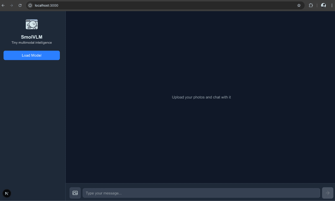
return (
<div className="flex h-screen bg-gray-50 dark:bg-gray-900">
{/* Sidebar */}
<aside className="hidden md:flex w-72 flex-col p-6 border-r border-gray-200 dark:border-gray-700 bg-white dark:bg-gray-800">
<div className="mb-6 text-center">
<img src="logo.png" alt="logo" className="w-16 h-16 mx-auto" />
<h1 className="text-xl font-bold mt-2 dark:text-white">SmolVLM</h1>
<p className="text-sm text-gray-500 dark:text-gray-300">
Tiny multimodal intelligence
</p>
</div>
This block renders the branding section of the sidebar. At the top, it displays the application’s logo (logo.png). Just below the logo, it shows the app name, “SmolVLM”, as a title. Finally, it includes a short, descriptive tagline — “Tiny multimodal intelligence” — that briefly communicates the app’s purpose. Together, this section provides users with a clear visual identity and context for the application before they begin interacting with it.
      {status === null && (
         <button
           className="px-4 py-2 rounded-lg bg-blue-500 hover:bg-blue-600 text-white font-medium"
           onClick={() => {
             if (worker.current) worker.current.postMessage({ type: "load" });
             setStatus("loading");
           }}
         >
           Load Model
         </button>
       )}
This block conditionally renders a “Load Model” button when the application’s status is null, indicating the model has not yet been loaded. When the user clicks this button, it sends a message to the web worker with the type "load" to start loading the model and immediately updates the local state status to "loading". This ensures the UI responds instantly, switching from idle to a loading state while the worker initializes the model in the background.
      {status === "loading" && (
         <div className="space-y-3">
           <p className="text-sm text-gray-600 dark:text-gray-300">
             {loadingMessage}
           </p>
           {progressItems.map(({ file, progress, total }, i) => (
             <Progress key={i} text={file} percentage={progress} total={total} />
           ))}
         </div>
       )}
This block is rendered when the application’s status is "loading". Instead of showing the button, it displays a message (loadingMessage) that describes the current loading step (such as which part of the model is being prepared). Alongside this, it iterates through progressItems, an array that tracks the progress of different model files being downloaded or initialized. For each file, it renders a Progress component that shows the file name, the amount processed (progress), and the total size (total). In short, this section provides the user with real-time feedback on the model’s loading progress.
      {status === "ready" && (
         <div className="flex justify-center mt-4">
           <p className="text-green-500 text-sm font-medium">Model Loaded Successfully… ✅</p>
         </div>
       )}

       {error && <p className="text-red-500 text-sm">Error: {error}</p>}
     </aside>
This block handles two possible outcomes after the loading phase.
First, if the status is "ready", it means the model has finished loading successfully. In that case, a confirmation message is displayed in the sidebar — “Model Loaded Successfully… ✅” — to clearly inform the user that the system is ready for use.
Second, if there’s any issue during loading or inference, the error variable will contain an error message. When the error is not null, a red error message is shown instead, alerting the user that something went wrong.
Together, these conditions provide clear feedback about whether the model is ready to run or if a problem occurred.
     {/* Main Chat */}
     <main className="flex flex-col flex-1 h-full">
       <div
         ref={chatContainerRef}
         className="flex-1 overflow-y-auto p-6 space-y-4 scrollbar-thin"
       >
         <Chat messages={messages} isThinking={isThinking} isStreaming={isStreaming} />
       </div>
The <main> container serves as the central area where conversations take place. Inside it, there’s a scrollable <div> that uses the chatContainerRef reference. This ref allows the code to control scrolling (e.g., automatically keeping the view pinned to the latest messages when new ones appear).
Inside that scrollable area, the <Chat /> component is rendered. This component receives three props:
messages: the list of all user and assistant messages.isThinking: indicates whether the assistant is currently preparing a response (before tokens begin streaming in).isStreaming: whether the assistant is actively generating output tokens.
In short, this section displays the conversation history and updates it dynamically as the assistant processes or streams new messages.
       {/* Input Bar */}
       <div className="border-t border-gray-200 dark:border-gray-700 bg-white dark:bg-gray-800 p-4">
         <div className="flex items-center space-x-2">
           {/* Image upload button */}
           <label
             htmlFor="file-upload"
             className="flex items-center justify-center h-12 w-12 rounded-lg bg-gray-100 dark:bg-gray-700 cursor-pointer hover:bg-gray-200 dark:hover:bg-gray-600"
           >
             <ImageIcon className="h-6 w-6 text-gray-500 dark:text-gray-300" />
             <input
               ref={imageUploadRef}
               id="file-upload"
               type="file"
               accept="image/*"
               className="hidden"
               multiple
               onInput={async (e) => {
                 const input = e.target as HTMLInputElement;
                 const files = Array.from(input.files ?? []);
                 if (files.length === 0) return;
                 const readers = files.map(
                   (file) =>
                     new Promise<string>((resolve, reject) => {
                       const reader = new FileReader();
                       reader.onload = (e2) => resolve(e2.target?.result as string);
                       reader.onerror = reject;
                       reader.readAsDataURL(file);
                     })
                 );
                 const results = await Promise.all(readers);
                 setImages((prev) => [...prev, ...results]);
                 input.value = "";
               }}
             />
           </label>

           {/* Textarea */}
           <div className="flex-1">
             <textarea
               ref={textareaRef}
               className="w-full h-12 rounded-lg border border-gray-300 dark:border-gray-600 px-3 py-2 resize-none bg-gray-50 dark:bg-gray-700 text-gray-900 dark:text-gray-100 flex items-center"
               placeholder="Type your message..."
               rows={1}
               value={input}
               disabled={status !== "ready"}
               onKeyDown={(e) => {
                 if (validInput && !isStreaming && e.key === "Enter" && !e.shiftKey) {
                   e.preventDefault();
                   onEnter(input, images);
                 }
               }}
               onInput={(e) => setInput((e.target as HTMLTextAreaElement).value)}
             />
           </div>
This block implements the input bar, where users interact with the assistant by uploading images or typing messages.
First, there’s the image upload button. It’s styled as an icon inside a label, which, when clicked, opens the file picker. The hidden <input type="file" /> allows users to select multiple images. Each file is read using a FileReader, converted into a Data URI, and stored in the images state via setImages. This lets the chat display and send images along with text messages.
Next is the textarea input field, referenced by textareaRef. It’s where users type their prompts. The value is bound to the input state, so changes are tracked in real time. The input is disabled until the model is fully loaded (status === "ready"). A key handler ensures that pressing Enter (without Shift) sends the message via onEnter, while Shift+Enter allows multi-line input.
In short, this part handles user input collection — selecting images and typing messages — and prepares them for sending to the assistant.
        {/* Send / Stop button */}
           {isStreaming ? (
             <button
               onClick={onInterrupt}
               className="flex items-center justify-center h-12 w-12 rounded-lg bg-red-500 hover:bg-red-600 text-white"
             >
               <StopIcon className="h-6 w-6" />
             </button>
           ) : (
             <button
               disabled={!validInput}
               onClick={() => onEnter(input, images)}
               className={`flex items-center justify-center h-12 w-12 rounded-lg ${validInput
                 ? "bg-blue-500 hover:bg-blue-600 text-white"
                 : "bg-gray-300 dark:bg-gray-600 text-gray-500"
                 }`}
             >
               <ArrowRightIcon className="h-6 w-6" />
             </button>
           )}
         </div>

         {images.length > 0 && (
           <div className="flex mt-2 space-x-2 overflow-x-auto">
             {images.map((src, i) => (
               <ImagePreview
                 key={i}
                 src={src}
                 onRemove={() =>
                   setImages((prev) => prev.filter((_, j) => j !== i))
                 }
                 className="w-16 h-16 rounded-md border border-gray-300 dark:border-gray-600 object-cover"
               />
             ))}
           </div>
         )}
       </div>
     </main>
   </div>
 );
}
This block finalizes the input section with two key parts: the send/stop button and the image preview list.
The send/stop button changes dynamically based on the assistant’s state. If isStreaming is true (meaning the assistant is currently generating a response), a red stop button is shown. Clicking it calls onInterrupt, which sends an interrupt message to the worker, stopping the response. Otherwise, when isStreaming is false, a blue send button appears. This button is disabled unless validInput (text or images are present). When clicked, it triggers onEnter(input, images), submitting the user’s message and attached images to the chat.
Below the button, if any images are staged (images.length > 0), an image preview list is displayed. Each preview is rendered using the ImagePreview component, showing a small thumbnail. Next to each image is a remove option that updates the images state by filtering out the deleted item. This allows users to review and manage uploaded images before sending them.
Altogether, this part handles sending messages, interrupting responses, and managing attached images, making the chat interface interactive and user-friendly.
src/app/worker.ts: Web Worker That Runs the Model
It runs the heavy Transformers.js code in a separate thread so the UI remains responsive. It loads the processor and model, handles model generation, streams tokens back to the main thread, and responds to control messages (check, load, generate, interrupt, reset).
import {
 AutoProcessor,
 AutoModelForVision2Seq,
 TextStreamer,
 InterruptableStoppingCriteria,
 load_image,
} from "@huggingface/transformers";

const MAX_NEW_TOKENS = 1024;
This block imports the core utilities required from Transformers.js.
AutoProcessor: preprocesses inputs (text and images) into the correct format understood by the model.AutoModelForVision2Seq: loads SmolVLM, which is a vision-to-text (vision-language) model.TextStreamer: streams tokens from the model in real time so responses appear as they are generated.InterruptableStoppingCriteria: allows generation to stop midway when the user clicks the stop button.load_image: converts images into tensors suitable for the model.
We also set MAX_NEW_TOKENS = 1024, which serves as a generation cap — preventing the model from generating excessively long responses.
let fp16_supported = false;
async function check() {
 try {
   const adapter = await (navigator as any).gpu.requestAdapter();
   if (!adapter) {
     throw new Error("WebGPU is not supported (no adapter found)");
   }
   fp16_supported = adapter.features.has("shader-f16");
 } catch (e) {
   self.postMessage({
     status: "error",
     data: String(e),
   });
 }
}
We define a flag, fp16_supported, to track whether the browser supports 16-bit floating-point (FP16) precision on the GPU. Running models in FP16 is both more memory-efficient and faster, making this check valuable.
The check function runs asynchronously. It requests a GPU adapter from the browser’s WebGPU API. If no adapter is found, WebGPU isn’t available, and an error is thrown.
If the adapter exists, the function checks whether it supports the shader-f16 feature, which indicates that the GPU can handle FP16 operations. The result is stored in fp16_supported.
If an error occurs at any step, the function sends a message back to the main thread (self.postMessage) with status: "error" and the error string so the UI can display it.
class SmolVLM {
 static model_id = "HuggingFaceTB/SmolVLM-256M-Instruct";
 static processor: any;
 static model: any;

 static async getInstance(progress_callback: any = undefined) {
   this.processor ??= AutoProcessor.from_pretrained(this.model_id, {
     progress_callback,
   });

   this.model ??= AutoModelForVision2Seq.from_pretrained(this.model_id, {
     dtype: "fp32",
     device: "webgpu",
     progress_callback,
   });

   return Promise.all([this.processor, this.model]);
 }
}
This SmolVLM class is a simple wrapper around loading the processor and model for the SmolVLM-256M-Instruct checkpoint from Hugging Face, and it uses WebGPU for inference in the browser.
Here’s what’s happening:
Static Properties
model_idis fixed to"HuggingFaceTB/SmolVLM-256M-Instruct", the model you’re loading.processorandmodelare declared as static, so they are shared across all calls. Once loaded, they’ll stay cached in memory.
getInstance Method
- This is an
asyncmethod that initializes and returns both the processor and the model. - It uses the nullish coalescing assignment (
??=) operator to ensure that the processor and model are only created once. If they’re already initialized, the existing ones are reused.
Processor
- Created with
AutoProcessor.from_pretrained, which loads the pre/post-processing logic (e.g., tokenization, image transforms). - Accepts a
progress_callbackto update UI while loading.
Model
- Created with
AutoModelForVision2Seq.from_pretrained. - It’s explicitly set to
dtype: "fp32"(32-bit floating point) anddevice: "webgpu",so it runs in the browser using WebGPU. - The same
progress_callbackis passed here as well.
Return Value
- Returns both
processorandmodeltogether as aPromise.all, so the caller can destructure them once they’re ready.
This structure makes it easy to load the model only once and reuse it throughout your app. Later, if you detect fp16_supported (from your earlier worker check), you can replace dtype: "fp32" with "fp16" for faster inference.
const stopping_criteria = new InterruptableStoppingCriteria();

let past_key_values_cache = null;
interface Message {
 content: any;
}
stopping_criteria
- Creates a new instance of
InterruptableStoppingCriteria(). - Used when generating text with Hugging Face models. It allows you to interrupt generation midstream (e.g., if the user cancels or a stop condition is met).
past_key_values_cache
- Initialized as
null. This will later store cached attention key/value tensors from the model’s previous forward pass. - By reusing this cache, you can speed up text generation since the model doesn’t need to recompute past states each time — it only processes the new tokens.
Message Interface
- A TypeScript interface with a single field:
async function generate(messages: Message[]) {
 // For this demo, we only respond to the last message
 messages = messages.slice(-1);

 // Retrieve the text-generation pipeline.
 const [processor, model] = await SmolVLM.getInstance();

 // Load all images
 const images = await Promise.all(
   messages
     .map((x) => x.content)
     .flat(Infinity)
     .filter((msg) => msg.image !== undefined)
     .map((msg) => load_image(msg.image)),
 );
Line 54 defines an asynchronous function to generate the assistant’s response and takes an array of Message objects as input. For simplicity, this demo processes only the most recent message — slice(-1) keeps only the last element of the array (Line 56).
Retrieve model and processor (Line 59)
- Calls the
getInstance()method of theSmolVLMclass. Returns the processor (for preparing images and text) and the model (for generating responses). - Using
awaitensures the model and processor are fully loaded before continuing.
Load all images from the messages (Lines 62-68)
messages.map(x => x.content)extracts the content arrays from each message..flat(Infinity)flattens nested arrays of content..filter(msg => msg.image !== undefined)keeps only content items that have an image..map(msg => load_image(msg.image))converts each image URI into an image object that the model can process.
Promise.all(...)ensures all images are loaded asynchronously before proceeding.
This block prepares the latest user message and loads all its associated images so the model can generate a response.
 // Prepare inputs
 const text = processor.apply_chat_template(messages, {
   add_generation_prompt: true,
 });
 const inputs = await processor(text, images, {
   // Set `do_image_splitting: true` to split images into multiple patches.
   // NOTE: This uses more memory, but can provide more accurate results.
   // do_image_splitting: false,
 });

 let startTime;
 let numTokens = 0;
 let tps: number | undefined;
 const token_callback_function = (tokens: any) => {
   startTime ??= performance.now();

   if (numTokens++ > 0) {
     tps = (numTokens / (performance.now() - startTime)) * 1000;
   }
 };
 const callback_function = (output: any) => {
   self.postMessage({
     status: "update",
     output,
     tps,
     numTokens,
   });
 };

 const streamer = new TextStreamer(processor.tokenizer, {
   skip_prompt: true,
   skip_special_tokens: true,
   callback_function,
   token_callback_function,
 });

 // Tell the main thread we are starting
 self.postMessage({ status: "start" });
Prepare text input using the processor (Lines 71-73)
apply_chat_template()formats the conversation into a prompt string suitable for the model. Theadd_generation_prompt: trueoption appends the model’s response prompt, so it knows to generate output after the user’s message.
Process text and images together (Lines 74-78)
- Calls the processor with both text and images. Converts them into a model-ready input format (tensors on WebGPU). The optional
do_image_splittingcan split images into multiple patches for finer analysis, but it uses more memory.
Initialize streaming metrics (Lines 80-82)
startTime: keeps track of when the generation begins.numTokens: counts the number of tokens generated so far.tps: tokens per second, calculated dynamically.
Token callback function (Lines 83-89)
- Called every time a new token is generated. Sets
startTimeto the first time a token is generated. Updatestps(tokens per second) for performance monitoring.
Output callback function (Lines 90-97)
- Sends the current output string, token metrics, and
tpsback to the main thread for live streaming.
Set up the text streamer (Lines 99-104)
TextStreamerstreams tokens as they are generated, rather than waiting for the full output.- Options:
skip_prompt: don’t resend the prompt text.skip_special_tokens: ignore model-specific control tokens.callback_functionandtoken_callback_functionhandle updates in real-time.
Notify the main thread that generation has started (Line 107)
- Tells the main thread to show the “assistant is thinking” state in the UI.
This block prepares the text+image input, initializes token streaming, and sets up callbacks to send incremental outputs and token metrics to the main thread in real-time. It effectively allows live assistant responses with streaming feedback.
  const { past_key_values, sequences } = await model
   .generate({
     ...inputs,
     // TODO: Add back when fixed
     // past_key_values: past_key_values_cache,

     // Sampling
     do_sample: false,
     repetition_penalty: 1.1,
     // top_k: 3,
     // temperature: 0.2,

     max_new_tokens: MAX_NEW_TOKENS,
     streamer,
     stopping_criteria,
     return_dict_in_generate: true,
   })
   .catch((e: unknown) => {
     self.postMessage({
       status: "error",
       data: String(e),
     });
   });
 past_key_values_cache = past_key_values;

 const decoded = processor.batch_decode(sequences, {
   skip_special_tokens: true,
 });

 // Send the output back to the main thread
 self.postMessage({
   status: "complete",
   output: decoded,
 });
}
Generate model output (Lines 109-125)
- Calls the model’s
generate()function to produce the assistant’s response.inputscontains the processed text and image tensors. The optionalpast_key_values(currently commented out) would enable incremental generation for more efficient future messages. - Sampling settings:
do_sample: false: deterministic generation (no random sampling).repetition_penalty: 1.1: discourages repeating the same tokens.- Other options (e.g.,
top_kandtemperature) are commented out, but could enable creative sampling.
max_new_tokens: limits the number of tokens generated in this call.streamer: streams tokens in real-time back to the main thread.stopping_criteria: allows interruption if the user clicks stop.return_dict_in_generate: true: returns a dictionary containing bothpast_key_valuesand generatedsequences.
Error handling (Lines 126-131)
- Catches any error during generation and sends it back to the main thread for display in the UI.
Update past key values cache (Line 132)
- Saves the
past_key_valuesfor potential future incremental generation, allowing faster responses if you continue the conversation.
Decode the generated sequences (Lines 134-136)
- Converts the model’s token IDs into readable text. Setting
skip_special_tokens: trueremoves tokens like[CLS],[PAD], or any model-specific special tokens.
Send final output back to the main thread (Lines 139-143)
- Notifies the main thread that the generation is finished. The decoded output is appended to the chat, and the UI can stop showing the “thinking” or streaming indicator.
This block generates the actual response. It streams tokens in real-time, applies deterministic or sampling-based generation, handles errors, caches past key values for future efficiency, decodes the tokens into readable text, and finally sends the complete response back to the main UI.
async function load() {
 self.postMessage({
   status: "loading",
   data: "Loading model...",
 });

 // Load the pipeline and save it for future use.
 const [processor, model] = await SmolVLM.getInstance((x: unknown) => {
   // We also add a progress callback to the pipeline so that we can
   // track model loading.
   self.postMessage(x);
 });

 self.postMessage({ status: "ready" });
}
Notify main thread that loading has started (Lines 146-149)
- Immediately notifies the main thread that model loading is starting, so the UI can display a loading message or progress bar.
Load the model and processor (Lines 152-156)
- Calls the
SmolVLM.getInstance()static method to load both the processor and the model. - Accepts an optional progress callback (
x => self.postMessage(x)):- Any progress events emitted during model loading are sent back to the main thread.
- This allows the UI to update individual file download progress for the model.
- The loaded processor and model are cached inside
SmolVLMfor future use, so repeated calls don’t reload them.
Notify main thread that the model is ready (Line 158)
- Once loading finishes successfully, send a ready signal. The UI can now enable the chat input, image uploads, and the “send” button.
The load() function is responsible for loading the model and processor, sending progress updates during the process, and finally notifying the main thread that the model is ready for inference. This keeps the UI responsive and informs the user about the loading state.
self.addEventListener("message", async (e) => {
 const { type, data } = e.data;

 switch (type) {
   case "check":
     check();
     break;

   case "load":
     load();
     break;

   case "generate":
     stopping_criteria.reset();
     generate(data);
     break;

   case "interrupt":
     stopping_criteria.interrupt();
     break;

   case "reset":
     past_key_values_cache = null;
     stopping_criteria.reset();
     break;
 }
});
This code listens for messages from the main thread and triggers the corresponding action inside the worker:
Listen for messages (Lines 161 and 162)
- Every time the main thread sends a message to the worker using
worker.postMessage, this event listener is triggered. The message is then destructured intotype(the action to perform) anddata(the accompanying information, such as user messages).
Switch based on message type (Lines 164-187)
check: calls thecheck()function to detect WebGPU support and FP16 availability.load: calls theload()function to load the model and processor, sending progress updates to the main thread.generate: resets thestopping_criteriaand runs thegenerate()function with the provided messages. This triggers the model to produce outputs.interrupt: interrupts the current generation process if it’s running. Useful when the user clicks “Stop”.reset: clears the cached past key values and resets the stopping criteria, preparing the model for a fresh conversation.
This block serves as the worker’s central message router. It connects the main thread’s actions (load model, generate output, stop, reset) to the corresponding worker functions, enabling asynchronous, non-blocking inference in the browser.
src/utilities/Chat.tsx: Render Chat Messages and Status
"use client";

import { cn } from "@/utilities/utils";
import type { Message } from "@/utilities/types";

interface ChatProps {
 messages: Message[];
 isThinking: boolean;
 isStreaming: boolean;
}
The file starts with "use client"; to indicate that this component is a client-side React component in Next.js. This ensures that hooks like useState and useEffect work correctly on the client.
Next, we import the cn utility from our utils.tsx file. This is typically a small helper that conditionally combines class names, which is useful for applying dynamic CSS classes.
We also import the Message type from types.ts. This provides type safety when handling chat messages, ensuring each message object has the correct structure expected by the component.
Finally, we define the props for the Chat component using a TypeScript interface ChatProps. This includes:
messages: an array ofMessageobjects representing the conversation history.isThinking: a boolean indicating whether the assistant is currently preparing a response (before any tokens are streamed).isStreaming: a boolean indicating whether the assistant is actively streaming its response token by token.
This setup ensures the component receives all necessary data and state flags to render the chat conversation dynamically and correctly.
export default function Chat({ messages, isThinking, isStreaming }: ChatProps) {
 if (messages.length === 0) {
   return (
     <div className="flex h-full items-center justify-center text-gray-500 dark:text-gray-400">
       Upload your photos and chat with it
     </div>
   );
 }

 return (
   <div className="space-y-4">
     {messages.map((message, i) => (
       <div
         key={i}
         className={cn(
           message.role === "user"
             ? "ml-auto max-w-[80%] flex flex-col items-end space-y-1"
             : "max-w-[80%] flex flex-col items-start space-y-1"
         )}
       >
         {message.content.map((c, j) => {
           if (c.type === "text") {
             return (
               <div
                 key={j}
                 className={cn(
                   "p-3 rounded-lg",
                   message.role === "user"
                     ? "bg-blue-500 text-white"
                     : "bg-gray-200 dark:bg-gray-700 text-gray-900 dark:text-gray-100"
                 )}
               >
                 {c.text}
               </div>
             );
           } else {
             return (
               <img
                 key={j}
                 src={c.image}
                 alt="uploaded"
                 className="rounded-lg max-w-xs"
               />
             );
           }
         })}
       </div>
     ))}

     {/* Assistant status */}
     {isThinking && (
       <div className="flex items-center space-x-1 text-gray-500 dark:text-gray-400">
         <span className="animate-bounce">●</span>
         <span className="animate-bounce delay-150">●</span>
         <span className="animate-bounce delay-300">●</span>
       </div>
     )} {/* Streaming indicator */} {isStreaming && !isThinking && (
       <div className="text-sm text-gray-400">Assistant is writing…</div>
     )}
   </div>
 );
}
The Chat function is the main component responsible for rendering the conversation between the user and the assistant. It receives three props: messages, isThinking, and isStreaming.
The first block handles the empty state: if no messages exist yet, it displays a centered placeholder with the text "Upload your photos and chat with it". This provides a friendly prompt to the user before any interaction occurs.
Once messages exist, the component maps over each message and renders them sequentially. Each message is wrapped in a <div> with classes applied conditionally using the cn utility: messages from the user are aligned to the right (ml-auto, items-end), while assistant messages are aligned to the left (items-start). Both have a max width of 80% to prevent stretching across the entire chat window.
Inside each message, the component iterates over message.content. This allows the chat to render mixed content: text or images. For text content (c.type === "text"), it renders a <div> with background color depending on the sender: blue for the user and gray (with dark mode support) for the assistant. The text itself is displayed inside this styled container.
For image content (c.type === "image"), it renders an <img> element with rounded corners and a maximum width, showing the uploaded or assistant-provided images inline with the conversation.
After all messages are rendered, the component shows the assistant’s status. If isThinking is true, it displays a small animated bouncing dot indicator to show the assistant is preparing a response. If isStreaming is true (but isThinking is false), it shows a simple text indicator "Assistant is writing…", letting the user know that tokens are actively being streamed and the assistant is generating its response.
Overall, this component handles dynamic rendering of text and image messages while providing clear visual feedback about the assistant’s current state.
src/utilities/ImagePreview.tsx: Small Image Thumbnail with Remove Button
import React from "react";
import { useState } from "react";
import CrossIcon from "@/icons/CrossIcon";

interface ImagePreviewProps extends React.HTMLAttributes<HTMLDivElement> {
 src: string;
 onRemove: () => void;
}

export default function ImagePreview({ src, onRemove, ...props }: ImagePreviewProps) {
 const [hover, setHover] = useState(false);

 return (
   <div
     {...props}
     onMouseEnter={() => setHover(true)}
     onMouseLeave={() => setHover(false)}
     className={`relative inline-block ${props.className || ""}`}
   >
     <CrossIcon
       onClick={onRemove}
       className={`absolute top-1 right-1 w-4 h-4 cursor-pointer
         dark:fill-gray-400 dark:text-gray-100 fill-gray-200 text-gray-800
         ${hover ? "" : "hidden"}`}
     />
     <img
       src={src}
       alt="Upload preview"
       className="w-full h-full object-cover rounded-md"
     />
   </div>
 );
}
The ImagePreview component displays a small thumbnail of an uploaded image with an option to remove it. It accepts two main props: src (the image source) and onRemove (a callback function to remove the image). It also supports standard <div> attributes via ...props.
The component uses a hover state (useState(false)) to track whether the mouse is currently over the image container. This allows the cross (remove) button to appear only when hovering.
The root <div> wraps the image and the cross icon. It spreads any additional props onto the container and sets up onMouseEnter and onMouseLeave events to toggle the hover state. The container also has the class relative to ensure that the cross icon, which is absolutely positioned, is placed relative to this container.
Inside the container, a CrossIcon is rendered. Its onClick is connected to onRemove so that clicking it removes the image. The icon is absolutely positioned at the top-right corner (top-1 right-1) and only visible when hover is true; otherwise, it’s hidden.
Finally, the <img> element displays the actual image, filling the container while maintaining the aspect ratio using object-cover, and it has rounded corners for a neat appearance.
Overall, this component provides a compact, reusable image preview with a hover-based remove button, perfect for displaying uploaded images in a chat or form interface.
src/utilities/Progress.tsx: Loading/Progress Bar
function formatBytes(size: number) {
 const i = size == 0 ? 0 : Math.floor(Math.log(size) / Math.log(1024));
 return (
   +(size / Math.pow(1024, i)).toFixed(2) * 1 +
   ["B", "kB", "MB", "GB", "TB"][i]
 );
}

type ProgressProps = {
 text: string;
 percentage?: number;
 total?: number;
};

export default function Progress({ text, percentage, total }: ProgressProps) {
 percentage ??= 0;
 return (
   <div className="w-full bg-gray-100 dark:bg-gray-700 text-left rounded-lg overflow-hidden mb-0.5">
     <div
       className="bg-blue-400 whitespace-nowrap px-1 text-sm"
       style={{ width: `${percentage}%` }}
     >
       {text} ({percentage.toFixed(2)}%
       {typeof total === "number" && !isNaN(total) ? ` of ${formatBytes(total)}` : ""})
     </div>
   </div>
 );
}
The Progress component visually represents the progress of file downloads or model-loading tasks in the SmolVLM app. It accepts three props:
text: the label for the progress item, usually the filename or task description.percentage: the completion percentage of the task, which defaults to0if not provided.total: the total size of the file or task, used to show a human-readable size.
The formatBytes function converts a numeric byte value into a human-readable format (B, kB, MB, GB, TB). It calculates the appropriate unit by taking the logarithm of the size with base 1024 and then formats the result with two decimal points.
In the component itself, a container <div> represents the full progress bar, styled with a gray background. Inside it, another <div> represents the completed portion of the progress bar, styled with a blue background and a dynamic width based on the percentage prop. The inner <div> also displays the text along with the percentage, and if a valid total is provided, it appends the formatted total size using formatBytes.
Overall, this component is a reusable, clean way to show the loading status of multiple files or tasks, with both visual and textual feedback.
src/utilities/types.ts: Typescript Types
export type MessageContent =
 | { type: "image"; image: string }
 | { type: "text"; text: string };

export type Message = {
 role: "user" | "assistant";
 content: MessageContent[];
};
The types.ts file defines TypeScript types for the chat messages used in the SmolVLM app.
MessageContent: This is a union type that represents the content of a single message. A message can either be:- An image:
{ type: "image"; image: string }: whereimageis a data-URL string of the uploaded or generated image. - A text:
{ type: "text"; text: string }: wheretextis a string representing the written message content.
- An image:
Message: This type represents a full chat message, which consists of:role: either"user"or"assistant", indicating who sent the message.content: an array ofMessageContentitems. This allows a single message to contain multiple pieces of content (e.g., a combination of text and images).
These types provide a structured way to handle both text and image messages, making it easier to render them correctly in components such as Chat.tsx and to maintain type safety throughout the app.
src/utilities/utils.tsx: Small Helper
import React from "react";

export function cn(...classes: Array<string | false | null | undefined>) {
 return classes.filter(Boolean).join(" ");
}
The cn function is a small utility that conditionally combines CSS class names into a single string.
- It accepts any number of arguments (
...classes) where each argument can be a string,false,null, orundefined. - Inside the function,
classes.filter(Boolean)removes any falsy values (false,null,undefined,""). - Finally,
.join(" ")concatenates the remaining valid class names with spaces, producing a single string ready to be used as aclassNameattribute in JSX.
Example usage:
const buttonClass = cn(
 "px-4 py-2 rounded",
 isPrimary && "bg-blue-500 text-white",
 isDisabled && "opacity-50 cursor-not-allowed"
);
// If isPrimary=true and isDisabled=false, result: "px-4 py-2 rounded bg-blue-500 text-white"
This is exactly how it’s used in Chat.tsx to dynamically assign CSS classes based on a message’s role.
src/icons/ArrowRightIcon.tsx: Arrow Right Icon
import React from "react";

export default function ArrowRightIcon(props: React.SVGProps<SVGSVGElement>) {
 return (
   <svg
     {...props}
     xmlns="http://www.w3.org/2000/svg"
     width="24"
     height="24"
     viewBox="0 0 24 24"
     fill="none"
     stroke="currentColor"
     strokeWidth="2"
     strokeLinecap="round"
     strokeLinejoin="round"
   >
     <path d="M5 12h14" />
     <path d="m12 5 7 7-7 7" />
   </svg>
 );
}
This file defines a React functional component that renders an SVG icon of a right-pointing arrow.
src/icons/CrossIcon.tsx: Cross Icon
import React from "react";

export default function CrossIcon(props: React.SVGProps<SVGSVGElement>) {
 return (
   <svg
     {...props}
     xmlns="http://www.w3.org/2000/svg"
     width="24"
     height="24"
     viewBox="0 0 24 24"
     fill="none"
     stroke="currentColor"
     strokeWidth="2"
     strokeLinecap="round"
     strokeLinejoin="round"
   >
     <path d="m9.75 9.75 4.5 4.5m0-4.5-4.5 4.5M21 12a9 9 0 1 1-18 0 9 9 0 0 1 18 0Z" />
   </svg>
 );
}
This file defines a React functional component that renders an SVG icon of a cross.
src/icons/ImageIcon.tsx: Image Icon
import React from "react";

export default function ImageIcon(props: React.SVGProps<SVGSVGElement>) {
 return (
   <svg
     {...props}
     xmlns="http://www.w3.org/2000/svg"
     width="24"
     height="24"
     viewBox="0 0 24 24"
     fill="none"
     stroke="currentColor"
     strokeWidth="2"
     strokeLinecap="round"
     strokeLinejoin="round"
   >
     <path d="m2.25 15.75 5.159-5.159a2.25 2.25 0 0 1 3.182 0l5.159 5.159m-1.5-1.5 1.409-1.409a2.25 2.25 0 0 1 3.182 0l2.909 2.909m-18 3.75h16.5a1.5 1.5 0 0 0 1.5-1.5V6a1.5 1.5 0 0 0-1.5-1.5H3.75A1.5 1.5 0 0 0 2.25 6v12a1.5 1.5 0 0 0 1.5 1.5Zm10.5-11.25h.008v.008h-.008V8.25Zm.375 0a.375.375 0 1 1-.75 0 .375.375 0 0 1 .75 0Z" />
   </svg>
 );
}
This file defines a React functional component that renders an SVG icon representing an image.
src/icons/StopIcon.tsx: Stop Icon
import React from "react";

export default function StopIcon(props: React.SVGProps<SVGSVGElement>) {
 return (
   <svg
     {...props}
     xmlns="http://www.w3.org/2000/svg"
     width="24"
     height="24"
     viewBox="0 0 24 24"
     fill="none"
     stroke="currentColor"
     strokeWidth="2"
     strokeLinecap="round"
     strokeLinejoin="round"
   >
     <path d="M21 12a9 9 0 1 1-18 0 9 9 0 0 1 18 0Z" />
     <path
       fill="currentColor"
       d="M9 9.563C9 9.252 9.252 9 9.563 9h4.874c.311 0 .563.252.563.563v4.874c0 .311-.252.563-.563.563H9.564A.562.562 0 0 1 9 14.437V9.564Z"
     />
   </svg>
 );
}
This file defines a React functional component that renders a stop icon in SVG format.
Output
Since all our code is in place, we can run npm run dev to start the development server and view the app at http://localhost:3000.
What's next? We recommend PyImageSearch University.
86+ total classes • 115+ hours hours of on-demand code walkthrough videos • Last updated: March 2026
★★★★★ 4.84 (128 Ratings) • 16,000+ Students Enrolled
I strongly believe that if you had the right teacher you could master computer vision and deep learning.
Do you think learning computer vision and deep learning has to be time-consuming, overwhelming, and complicated? Or has to involve complex mathematics and equations? Or requires a degree in computer science?
That’s not the case.
All you need to master computer vision and deep learning is for someone to explain things to you in simple, intuitive terms. And that’s exactly what I do. My mission is to change education and how complex Artificial Intelligence topics are taught.
If you're serious about learning computer vision, your next stop should be PyImageSearch University, the most comprehensive computer vision, deep learning, and OpenCV course online today. Here you’ll learn how to successfully and confidently apply computer vision to your work, research, and projects. Join me in computer vision mastery.
Inside PyImageSearch University you'll find:
- ✓ 86+ courses on essential computer vision, deep learning, and OpenCV topics
- ✓ 86 Certificates of Completion
- ✓ 115+ hours hours of on-demand video
- ✓ Brand new courses released regularly, ensuring you can keep up with state-of-the-art techniques
- ✓ Pre-configured Jupyter Notebooks in Google Colab
- ✓ Run all code examples in your web browser — works on Windows, macOS, and Linux (no dev environment configuration required!)
- ✓ Access to centralized code repos for all 540+ tutorials on PyImageSearch
- ✓ Easy one-click downloads for code, datasets, pre-trained models, etc.
- ✓ Access on mobile, laptop, desktop, etc.
Summary
In this project, we built a browser-based multimodal chat application powered by the SmolVLM model from Hugging Face. The app allows users to upload images and interact with an AI assistant that can analyze visuals and generate text responses in real time. Key features include WebGPU acceleration, streaming token updates, and progress tracking during model loading. The interface supports Markdown formatting, safe HTML rendering, and smooth animations for a responsive user experience. By leveraging libraries such as @huggingface/transformers, better-react-mathjax, dompurify, framer-motion, and marked, we created a robust, interactive, and secure chat system that showcases the power of modern multimodal AI directly in the browser.
Citation Information
Thakur, P. “Running SmolVLM Locally in Your Browser with Transformers.js,” PyImageSearch, P. Chugh, S. Huot, G. Kudriavtsev, and A. Sharma, eds., 2025, https://pyimg.co/j1ayp
@incollection{Thakur_2025_Running-SmolVLM-Locally-in-Browser-with-Transformers-js,
  author = {Piyush Thakur},
  title = {{Running SmolVLM Locally in Your Browser with Transformers.js}},
  booktitle = {PyImageSearch},
  editor = {Puneet Chugh and Susan Huot and Georgii Kudriavtsev and Aditya Sharma},
  year = {2025},
  url = {https://pyimg.co/j1ayp},
}
To download the source code to this post (and be notified when future tutorials are published here on PyImageSearch), simply enter your email address in the form below!

Download the Source Code and FREE 17-page Resource Guide
Enter your email address below to get a .zip of the code and a FREE 17-page Resource Guide on Computer Vision, OpenCV, and Deep Learning. Inside you'll find my hand-picked tutorials, books, courses, and libraries to help you master CV and DL!

Comment section
Hey, Adrian Rosebrock here, author and creator of PyImageSearch. While I love hearing from readers, a couple years ago I made the tough decision to no longer offer 1:1 help over blog post comments.
At the time I was receiving 200+ emails per day and another 100+ blog post comments. I simply did not have the time to moderate and respond to them all, and the sheer volume of requests was taking a toll on me.
Instead, my goal is to do the most good for the computer vision, deep learning, and OpenCV community at large by focusing my time on authoring high-quality blog posts, tutorials, and books/courses.
If you need help learning computer vision and deep learning, I suggest you refer to my full catalog of books and courses — they have helped tens of thousands of developers, students, and researchers just like yourself learn Computer Vision, Deep Learning, and OpenCV.
Click here to browse my full catalog.