Table of Contents
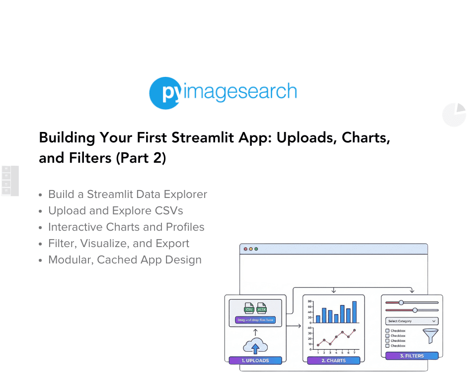
- Building Your First Streamlit App: Uploads, Charts, and Filters (Part 2)
- Upload Page: Custom CSV Uploads
- Profile Page: Descriptive Stats and Missingness
- Visualize Page: Line, Bar, Scatter, and Histogram
- Filter Page: Interactive Numeric Range Filtering
- Export Page: Download Filtered Data as CSV
- Summary
Building Your First Streamlit App: Uploads, Charts, and Filters (Part 2)
Continued from Part 1.
This lesson is part of a series on Streamlit Apps:
- Getting Started with Streamlit: Learn Widgets, Layouts, and Caching
- Building Your First Streamlit App: Uploads, Charts, and Filters (Part 1)
- Building Your First Streamlit App: Uploads, Charts, and Filters (Part 2) (this tutorial)
- Integrating Streamlit with Snowflake for Live Cloud Data Apps (Part 1)
- Integrating Streamlit with Snowflake for Live Cloud Data Apps (Part 2)
To learn how to upload, explore, visualize, and export data seamlessly with Streamlit, just keep reading.
Upload Page: Custom CSV Uploads
The Upload page transforms your app from a demo into a real tool.
It lets users bring their own CSV files, instantly view the data, and even generate quick summary statistics, all without touching the underlying code.
Code Block
elif page == "Upload":
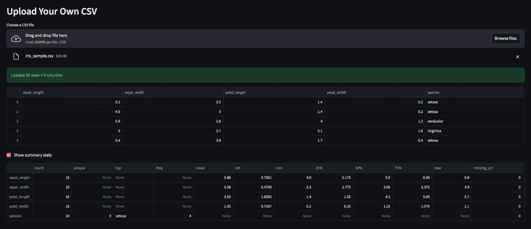
st.header("Upload Your Own CSV")
uploaded = st.file_uploader("Choose a CSV file", type="csv")
if uploaded:
user_df = load_uploaded_csv(uploaded)
st.success(f"Loaded {user_df.shape[0]} rows × {user_df.shape[1]} columns")
st.dataframe(user_df.head())
if st.checkbox("Show summary stats"):
st.dataframe(dataframe_profile(user_df))
else:
st.info("Upload a CSV to inspect it.")
Line-by-Line Explanation
- Page Header
st.header("Upload Your Own CSV")
This visually separates the Upload section and sets context immediately.
- File Input Widget
uploaded = st.file_uploader("Choose a CSV file", type="csv")
The st.file_uploader() widget opens a file picker and restricts uploads to CSVs only, preventing invalid file types.
When a user selects a file, uploaded becomes a Streamlit UploadedFile object (file-like); otherwise, it remains None.
- Reading and Displaying the Data
if uploaded:
    user_df = load_uploaded_csv(uploaded)
The helper load_uploaded_csv() from data_loader.py wraps pandas.read_csv(), cleanly isolating I/O logic.
This function can later evolve to handle different encodings, delimiters, or larger files without touching lesson2_main.py.
- Success Message and Preview
st.success(f"Loaded {user_df.shape[0]} rows × {user_df.shape[1]} columns")
st.dataframe(user_df.head())
Streamlit displays a friendly ✅ success banner showing the dataset dimensions, followed by a preview of the first few rows in an interactive table.
- Optional Profiling Checkbox
if st.checkbox("Show summary stats"):
    st.dataframe(dataframe_profile(user_df))
The checkbox toggles a compact summary generated by the dataframe_profile() utility.
This summary leverages pandas.describe() and adds a missing_pct column, giving a quick snapshot of data health.
- Default Prompt
else:
    st.info("Upload a CSV to inspect it.")
When no file is uploaded, an ℹ️ info box keeps the UI friendly rather than blank or error-filled.
Teaching Points
- Streamlit keeps uploaded files available in memory for the session; for very large datasets, you may want to extend
load_uploaded_csv()to read in chunks. - Keeping this logic self-contained makes the Upload page both beginner-friendly and production-ready.
- The combination of widgets (
file_uploader, checkbox) and helpers (load_uploaded_csv,dataframe_profile) models the separation of concerns pattern that runs through all lessons.
Next, we’ll move to the Profile page (Descriptive Stats), where you’ll create a concise, reusable data-profiling view for quick quality checks.
Profile Page: Descriptive Stats and Missingness
The Profile page is your quick-look diagnostic view.
Before diving into modeling or visualization, you want to ensure your dataset is well-formed, with columns that have reasonable distributions, manageable missing values, and no unexpected anomalies.
This section introduces a lightweight version of that workflow using the dataframe_profile() helper.
Code Block
elif page == "Profile":
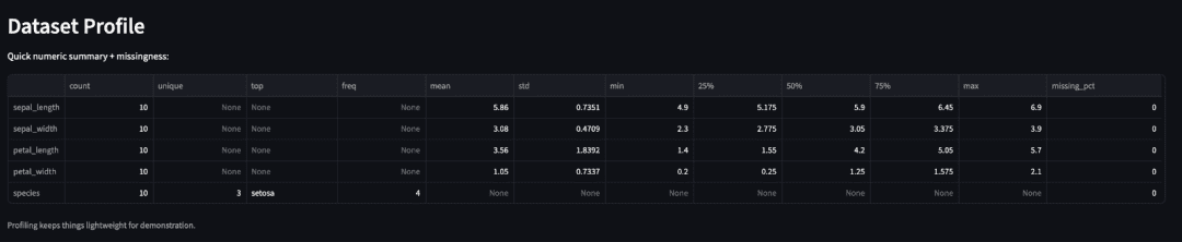
st.header("Dataset Profile")
st.write("Quick numeric summary + missingness:")
st.dataframe(dataframe_profile(base_df))
st.caption("Profiling keeps things lightweight for demonstration.")
Line-by-Line Explanation
- Page Header and Context
st.header("Dataset Profile")
st.write("Quick numeric summary + missingness:")
The header sets the page title.
The short description below clarifies that this is not a full-blown profiling library (e.g., ydata-profiling), just a focused snapshot of numeric features.
Generating the Profile
st.dataframe(dataframe_profile(base_df))
Here, dataframe_profile() from visualization.py does the heavy lifting:
- Calls
df.describe(include="all").transpose()to compute descriptive statistics for both numeric and non-numeric columns (e.g., mean/std for numeric data; count/unique/top for categorical data). - Adds a custom column,
missing_pct, computed as100 * (1 - count / len(df)), wherecountreflects non-null values per column. - Returns a tidy
pandas.DataFrameready for display.
This summary helps spot issues (e.g., NaNs, skewed distributions, or constant-valued columns) at a glance.
Caption for Clarity
st.caption("Profiling keeps things lightweight for demonstration.")
The caption reminds readers that this is a teaching-grade implementation, easy to extend later with custom metrics or visualization.
Why It Matters
This page introduces data quality awareness early in the app’s lifecycle.
You don’t need fancy visualizations to catch most dataset issues — just a clean descriptive table.
In future lessons, you can extend this function with:
- Cardinality counts (
df.nunique()) - Skewness or kurtosis metrics
- Type inference and alert highlighting
mean, std, and missing_pct), plus a caption below (source: image by the author).Next, we’ll move on to the Visualize page, where users can build multiple chart types (e.g., line, bar, scatter, and histogram) directly in the browser.
Visualize Page: Line, Bar, Scatter, and Histogram
The Visualize page transforms raw data into quick insights.
Instead of static tables, you’ll let users pick chart types and variables, and Streamlit will re-render the visualization instantly, making it ideal for exploratory data analysis (EDA).
Code Block
elif page == "Visualize":
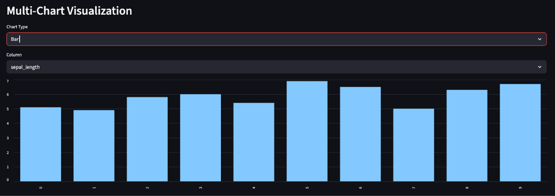
st.header("Multi-Chart Visualization")
df = base_df
numeric_cols = df.select_dtypes(include=["number"]).columns.tolist()
if not numeric_cols:
st.warning("No numeric columns to visualize.")
else:
chart_type = st.selectbox("Chart Type", ["Line", "Bar", "Scatter", "Histogram"])
if chart_type in {"Line", "Bar"}:
col = st.selectbox("Column", numeric_cols)
if chart_type == "Line":
st.line_chart(df[col])
else:
st.bar_chart(df[col])
elif chart_type == "Scatter":
x = st.selectbox("X", numeric_cols)
y = st.selectbox("Y", numeric_cols)
st.scatter_chart(df[[x, y]])
elif chart_type == "Histogram":
import matplotlib.pyplot as plt # local import
col = st.selectbox("Column", numeric_cols)
fig, ax = plt.subplots()
df[col].hist(ax=ax, bins=25, color="#4b8bbe", edgecolor="black")
ax.set_title(f"Histogram of {col}")
st.pyplot(fig)
Line-by-Line Explanation
1. Page Header and Data Prep
st.header("Multi-Chart Visualization")
df = base_df
numeric_cols = df.select_dtypes(include=["number"]).columns.tolist()
The page title sets the context, while the next line extracts all numeric columns, because visualization typically focuses on quantitative variables.
If no numeric columns exist (rare, but possible in user-uploaded data), the next block handles it gracefully.
2. Empty Data Guard
if not numeric_cols:
    st.warning("No numeric columns to visualize.")
This avoids a broken UI when users upload purely categorical data. Instead of failing silently, the app communicates clearly.
3. Chart Type Selection
chart_type = st.selectbox("Chart Type", ["Line", "Bar", "Scatter", "Histogram"])
The dropdown allows users to choose which visualization type to render. Each selection triggers a script rerun, re-rendering the chart instantly.
4. Line and Bar Charts (Built-in Shortcuts)
if chart_type in {"Line", "Bar"}:
    col = st.selectbox("Column", numeric_cols)
    if chart_type == "Line":
        st.line_chart(df[col])
    else:
        st.bar_chart(df[col])
Streamlit provides native st.line_chart() and st.bar_chart() for simple cases. These functions typically use Altair under the hood and automatically re-render when the user changes the selected column.
5. Scatter Chart (Two Variables)
elif chart_type == "Scatter":
    x = st.selectbox("X", numeric_cols)
    y = st.selectbox("Y", numeric_cols)
    st.scatter_chart(df[[x, y]])
Scatter plots require two numeric axes. st.scatter_chart() directly accepts a DataFrame slice with both columns and creates a responsive Altair plot, making it ideal for quick correlation checks.
6. Histogram (Matplotlib Integration)
elif chart_type == "Histogram":
    import matplotlib.pyplot as plt  # local import
    col = st.selectbox("Column", numeric_cols)
    fig, ax = plt.subplots()
    df[col].hist(ax=ax, bins=25, color="#4b8bbe", edgecolor="black")
    ax.set_title(f"Histogram of {col}")
    st.pyplot(fig)
For histograms, you switch to Matplotlib for finer control than Streamlit’s built-in chart helpers.
Using a local import keeps initial load times fast — Matplotlib only loads if the user selects “Histogram.”
The styling (color="#4b8bbe", edgecolor="black") gives it a clean, educational look.
Design and Performance Notes
- Keep the number of chart options small for simplicity; too many overwhelms beginners.
- When you expand this later (e.g., multi-series or grouped charts), modularize each visualization in a helper as you did with
iris_feature_scatter(). - Local imports for heavy libraries (e.g., Matplotlib) keep cold-start times low.
Next up: Filter Page, where you’ll add interactive range sliders to filter your dataset dynamically before exporting it.
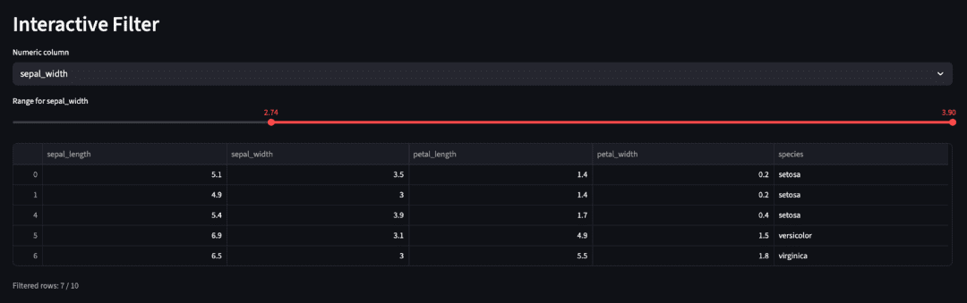
Filter Page: Interactive Numeric Range Filtering
The Filter page lets users narrow down the dataset interactively, without writing a single line of SQL or pandas code.
This introduces one of the most powerful patterns in Streamlit: reactive filtering combined with session state persistence.
Code Block
elif page == "Filter":
    st.header("Interactive Filter")
    df = base_df
    numeric_cols = df.select_dtypes(include=["number"]).columns.tolist()
    if not numeric_cols:
        st.warning("No numeric columns to filter.")
    else:
        target = st.selectbox("Numeric column", numeric_cols)
        min_v, max_v = float(df[target].min()), float(df[target].max())
        user_min, user_max = st.slider(
            f"Range for {target}", min_v, max_v, (min_v, max_v)
        )
        filtered = df[(df[target] >= user_min) & (df[target] <= user_max)]
        st.dataframe(filtered.head())
        st.caption(f"Filtered rows: {len(filtered)} / {len(df)}")
        st.session_state.filtered_df = filtered
Line-by-Line Explanation
1. Page Setup
st.header("Interactive Filter")
df = base_df
The section header labels this part of the UI clearly.
You start with base_df (the Iris sample or user-uploaded data) as your working dataset.
2. Detect Numeric Columns
numeric_cols = df.select_dtypes(include=["number"]).columns.tolist()
if not numeric_cols:
    st.warning("No numeric columns to filter.")
This ensures the filtering UI only appears when numeric data exists.
If the user uploaded purely categorical data, a friendly warning prevents confusion or runtime errors.
3. Column Selection
target = st.selectbox("Numeric column", numeric_cols)
The user selects which numeric column they want to filter.
This immediately triggers a script rerun, but Streamlit remembers the current target thanks to its automatic widget state handling.
4. Define Range Boundaries
min_v, max_v = float(df[target].min()), float(df[target].max())
You compute the column’s natural range from the DataFrame. This drives the slider limits.
Casting to float ensures compatibility across data types (e.g., int64 or numpy.float32).
5. Range Slider UI
user_min, user_max = st.slider(
    f"Range for {target}", min_v, max_v, (min_v, max_v)
)
This slider is the heart of the interactivity. It shows a draggable range selector initialized to the full data span.
Every movement of the slider updates user_min and user_max, triggering an instant rerun of the script with the new values.
6. Apply the Filter
filtered = df[(df[target] >= user_min) & (df[target] <= user_max)]
Here’s where the actual data transformation happens. You create a Boolean mask on the selected column and slice the DataFrame accordingly — entirely in-memory, no external dependencies.
7. Display Results and Stats
st.dataframe(filtered.head())
st.caption(f"Filtered rows: {len(filtered)} / {len(df)}")
The filtered preview table lets users verify their filter instantly.
The caption adds a quick performance cue, showing how many rows remain relative to the original dataset.
8. Persist Filtered Data in Session State
st.session_state.filtered_df = filtered
Saving the filtered subset in st.session_state ensures it persists across other pages.
That means when the user moves to the Export page next, it automatically accesses the filtered view without recomputation.
Teaching Notes
- The range slider + Boolean mask combo is one of the most versatile UI patterns in Streamlit.
- You could expand this by adding categorical filters using multiselect, or multi-column filtering with multiple sliders.
- The
session_statepersistence pattern here becomes essential in the next lesson, when working with live Snowflake queries.
Next up: Export Page, where we’ll let users download their filtered dataset as a CSV — the finishing touch for this lesson’s interactive workflow.
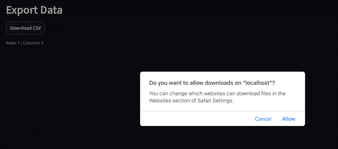
Export Page: Download Filtered Data as CSV
The Export page lets users save their filtered dataset instantly.
Instead of sending spreadsheets back and forth, they can apply filters in-app and export the results with a single click.
Code Block
elif page == "Export":
    st.header("Export Data")
    export_df = st.session_state.get("filtered_df", base_df)
    if export_df is None or export_df.empty:  # type: ignore
        st.info("Nothing to export yet. Apply a filter first if desired.")
    else:
        st.download_button(
            "Download CSV",
            export_df.to_csv(index=False).encode("utf-8"),
            file_name="data_export.csv",
            mime="text/csv",
        )
        st.caption(f"Rows: {len(export_df)} | Columns: {export_df.shape[1]}")
Line-by-Line Explanation
1. Page Setup and Data Retrieval
st.header("Export Data")
export_df = st.session_state.get("filtered_df", base_df)
The header introduces the page purpose.
You fetch filtered_df from st.session_state if available — this will exist only if the user used the Filter page.
If not, the fallback (base_df) ensures the export feature still works on the full dataset.
2. Guard Condition for Empty Data
if export_df is None or export_df.empty:
    st.info("Nothing to export yet. Apply a filter first if desired.")
This defensive check handles two edge cases:
- No filtering performed yet.
- Filter returned zero rows (e.g., the user set too narrow a range). Instead of throwing an error, the app politely informs the user what to do next.
3. Download Button
st.download_button(
    "Download CSV",
    export_df.to_csv(index=False).encode("utf-8"),
    file_name="data_export.csv",
    mime="text/csv",
)
This is where Streamlit’s simplicity shines.
st.download_button() automatically generates a clickable button that triggers a file download in the browser.
You serialize the DataFrame with to_csv(), encode to bytes, and specify a filename and MIME type.
No server configuration, no Flask routes — just one line of Python.
4. Feedback Caption
st.caption(f"Rows: {len(export_df)} | Columns: {export_df.shape[1]}")
The caption gives immediate confirmation of what the user exported, reducing the chance of confusion or mismatched datasets.
Best Practices and Notes
- Always specify a clear filename (
data_export.csv) — users appreciate predictable downloads. - If you allow user uploads, you could dynamically name the file after the source (e.g., “
filtered_” +uploaded.name). - For very large dataframes, consider streaming exports or ZIP compression — though for most CSV-sized datasets, this approach is perfectly fine.
Teaching Moment: Why This Page Matters
This small section closes the feedback loop — users can act on what they explored.
They’ve uploaded, filtered, visualized, and now exported their results — an entire analytics micro-workflow contained in a single Streamlit app.
In later lessons, this same pattern will evolve:
- Exporting query results from Snowflake (next lesson).
- Exporting model predictions or feature importance reports in MLOps lessons.
What's next? We recommend PyImageSearch University.

86+ total classes • 115+ hours hours of on-demand code walkthrough videos • Last updated: April 2026
★★★★★ 4.84 (128 Ratings) • 16,000+ Students Enrolled
I strongly believe that if you had the right teacher you could master computer vision and deep learning.
Do you think learning computer vision and deep learning has to be time-consuming, overwhelming, and complicated? Or has to involve complex mathematics and equations? Or requires a degree in computer science?
That’s not the case.
All you need to master computer vision and deep learning is for someone to explain things to you in simple, intuitive terms. And that’s exactly what I do. My mission is to change education and how complex Artificial Intelligence topics are taught.
If you're serious about learning computer vision, your next stop should be PyImageSearch University, the most comprehensive computer vision, deep learning, and OpenCV course online today. Here you’ll learn how to successfully and confidently apply computer vision to your work, research, and projects. Join me in computer vision mastery.
Inside PyImageSearch University you'll find:
- ✓ 86+ courses on essential computer vision, deep learning, and OpenCV topics
- ✓ 86 Certificates of Completion
- ✓ 115+ hours hours of on-demand video
- ✓ Brand new courses released regularly, ensuring you can keep up with state-of-the-art techniques
- ✓ Pre-configured Jupyter Notebooks in Google Colab
- ✓ Run all code examples in your web browser — works on Windows, macOS, and Linux (no dev environment configuration required!)
- ✓ Access to centralized code repos for all 540+ tutorials on PyImageSearch
- ✓ Easy one-click downloads for code, datasets, pre-trained models, etc.
- ✓ Access on mobile, laptop, desktop, etc.
Summary
In this lesson, you transformed a basic Streamlit prototype into a complete, interactive data-exploration app. You learned how to structure multi-section pages, handle file uploads, visualize data dynamically, and make your app genuinely useful for everyday analytics.
You also:
- Added sidebar navigation to organize multiple views.
- Used helper modules (
data_loader.py,visualization.py) for clean, reusable logic. - Created interactive charts with Altair, Streamlit’s built-in chart functions, and Matplotlib.
- Implemented CSV uploads and lightweight profiling to understand new datasets instantly.
- Applied interactive filtering and enabled one-click export of results.
- Experienced how Streamlit’s rerun model, caching, and widgets work together in a larger app.
In short, you now know how to go from a single “hello world” page to a shareable analytics tool — something you can hand to teammates and iterate on fast.
In the next lesson, you’ll connect your app to live Snowflake data, blending cloud queries with local exploration to build a truly data-driven Streamlit experience.
Citation Information
Singh, V. “Building Your First Streamlit App: Uploads, Charts, and Filters (Part 2),” PyImageSearch, P. Chugh, S. Huot, A. Sharma, and P. Thakur, eds., 2025, https://pyimg.co/pk8i0
@incollection{Singh_2025_Building-Your-First-Streamlit-App-Part-2,
  author = {Vikram Singh},
  title = {{Building Your First Streamlit App: Uploads, Charts, and Filters (Part 2)}},
  booktitle = {PyImageSearch},
  editor = {Puneet Chugh and Susan Huot and Aditya Sharma and Piyush Thakur},
  year = {2025},
  url = {https://pyimg.co/pk8i0},
}
To download the source code to this post (and be notified when future tutorials are published here on PyImageSearch), simply enter your email address in the form below!

Download the Source Code and FREE 17-page Resource Guide
Enter your email address below to get a .zip of the code and a FREE 17-page Resource Guide on Computer Vision, OpenCV, and Deep Learning. Inside you'll find my hand-picked tutorials, books, courses, and libraries to help you master CV and DL!

Comment section
Hey, Adrian Rosebrock here, author and creator of PyImageSearch. While I love hearing from readers, a couple years ago I made the tough decision to no longer offer 1:1 help over blog post comments.
At the time I was receiving 200+ emails per day and another 100+ blog post comments. I simply did not have the time to moderate and respond to them all, and the sheer volume of requests was taking a toll on me.
Instead, my goal is to do the most good for the computer vision, deep learning, and OpenCV community at large by focusing my time on authoring high-quality blog posts, tutorials, and books/courses.
If you need help learning computer vision and deep learning, I suggest you refer to my full catalog of books and courses — they have helped tens of thousands of developers, students, and researchers just like yourself learn Computer Vision, Deep Learning, and OpenCV.
Click here to browse my full catalog.